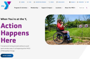
To improve navigation and accessibility, the YMCA of Metro Chicago recently created a new user-friendly website full of updates and improvements for the community.
Andy Adelmann, the chief technology officer, said the former edition of the site was over 10 years old. He said they heard from constituents the webpage was difficult to navigate especially when they wanted to find information, register for programs or sign up for memberships.
“User ease, experience, and friendliness collectively served as our North Star in developing both the infrastructure and interface of the new site,” said Adelmann. “We also wanted the website to better reflect the Y’s impact in our communities across the association by highlighting our programs, services, events and news in a more accessible place. Our teams are doing a lot of great work to support the communities we serve, and we wanted to showcase them doing so.”
The new website has been up and running since November 7, 2022.
Project Details and Features
Adelmann said the Y issued a request for proposal and selected American Eagle as their technology partner for the project.
“They worked with us to do a full assessment of the legacy site and research what our members, communities, donors and staff were looking for,” said Adelmann. “From that information and the content provided by our marketing team and programmatic teams, American Eagle helped us build a product that surpassed what any of us expected while meeting our budgetary goals.”
Brandon Davis, the head of marketing, said the YMCA of Metro Chicago has “never been easier” to connect with due to the new website. Davis said the makeover consisted of the following features:
- Improved user experience and ease for enhanced accessibility, less clicks, focused user journeys, and easier checkout process.
- Simplified site structure and navigation, reducing the number of core offering pages from 2,200 to 200.
- Data-driven personalization. Throughout the user journey on the website, the pages customize to you — your geographic location, programs and more.
- Modernized interface and playful tone.
- Clean, fresh design and approachable language.

Davis said the new ymcachicago.org is a “true representation” of the organization’s new brand.
“Everything about the new website represents progress through play: dramatically improved accessibility, ease and simplicity of navigation, playful and engaging content, and opportunities on every page to easily find, learn about, and register for our activities, programs and services,” said Davis.
Reaction and Advice
Adelmann said the website has been up for over just two weeks, and the Y is already receiving overwhelmingly positive feedback from external stakeholders.
“As with any website overhaul, or change in general, some folks had resistance at the beginning or requested additional assistance using the new site,” said Adelmann. “Since the launch, those types of requests have decreased by 90%.”
Davis said the YMCA’s staff and members formerly joked the former website was a dinosaur. “But like our dinosaurs of the past, the legacy website is extinct, and it’s been replaced with a website that’s been called modern, fresh and the opposite of what a dinosaur is,” he said.
For other community rec centers whose webpages are quickly becoming outdated, Adelmann advised to consider e-commerce as a new feature.
“Often, when you visit websites for community or nonprofit organizations, you might see a beautiful customer-facing website,” said Adelmann. “But when you try to donate or make a purchase, it’s a whole different and confusing story.”
Davis stressed the importance of websites can’t be understated and investments into them are smart for your business.
“Upgrades and improvements have to continually be made to meet the ever-evolving needs of the community,” said Davis. “Whether you embark on a website transformation or a small enhancement, always approach it with the consumer in mind: who they are, the way they talk, where they are and how they make purchases. Put the customer at the center of every choice you make. It will enable you to cut through the way things have been and move to the way things can be.”
Want more resources like this sent straight to your inbox each week? Sign up for a digital subscription here.


